Web3index Company Page Update:
Transforming Static Profiles into Dynamic Web3 Hubs

Web3index (developed by DcentraLab, now discontinued) was a professional directory platform designed to discover crypto ventures, facilitate networking, and drive collaborations across the ecosystem.
The platform automatically aggregated data from across the web into thousands of company profiles, allowing verified creators to claim their profiles and unlock features like editing their information, fundraising and direct messaging other projects.
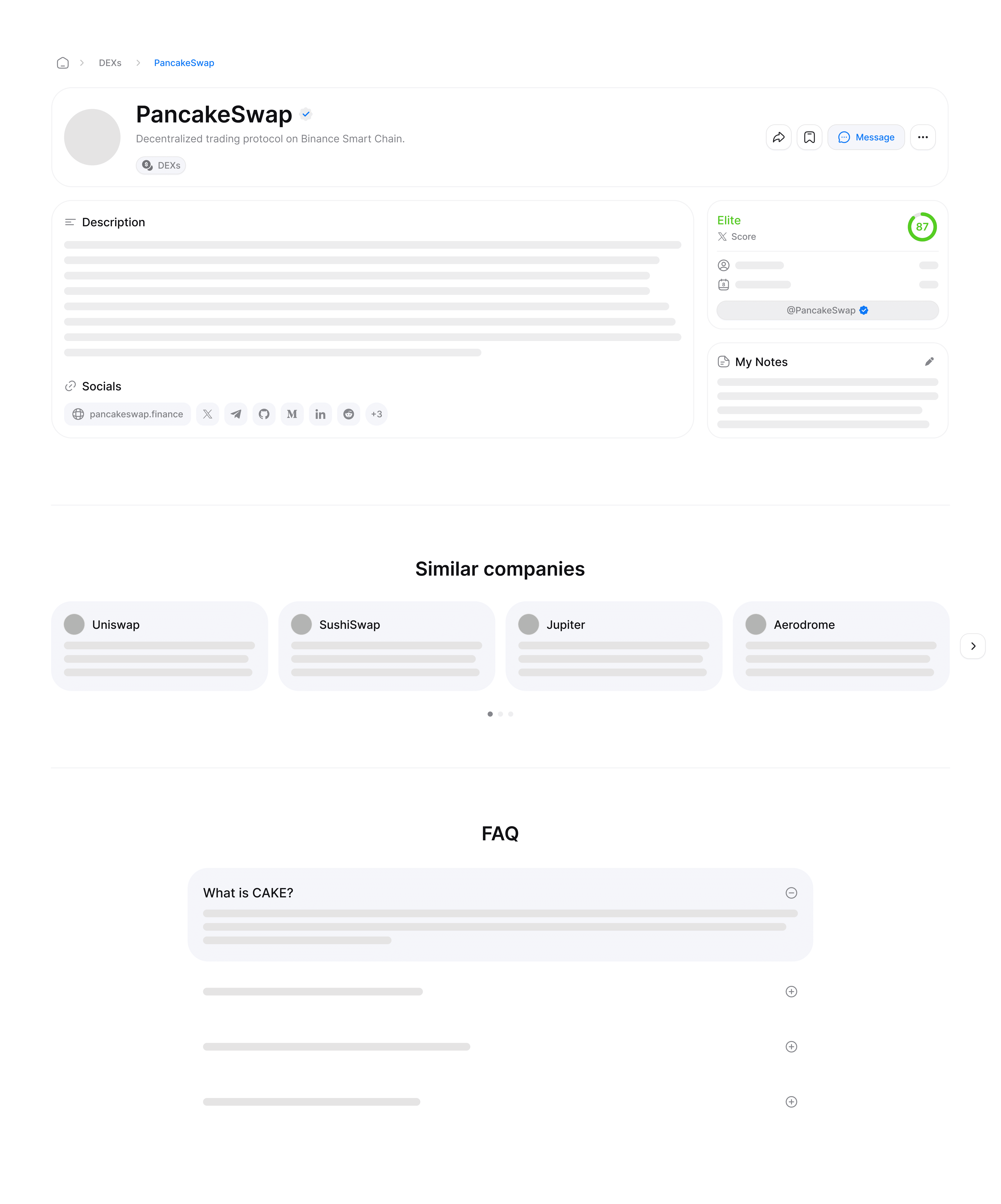
Existing layout of the company page.
Problem Statement
Static data made active Web3 projects look abandoned
Target Audience: Crypto project founders, Web3 investors, and community managers looking for valid, active, and trustworthy collaborations.
Challenge: Due to the nature of automatically scraped project data, many profiles felt static. In the fast-moving Web3 ecosystem, momentum is everything; if a crypto project’s profile looks abandoned or lacks updates, users and potential partners instantly lose confidence and interest.
The Opportunity: To bridge this gap, we decided to introduce a real-time, automatically aggregated Latest News section into the project profile. By algorithmically scraping and displaying relevant industry headlines, we aimed to transform static profiles into dynamic, trustworthy hubs that continuously prove a project's ongoing momentum without requiring manual maintenance from creators.

News section inspiration board.
Research & Insights
Finding the best structure for real-time updates
I brought to the table initial inspirations for layouts, drawing from both news sections and activity logs UI, and my first design iterations for our news section.
My findings were:
Time & Grouping Logic: Platforms alternate between absolute stamps (e.g., “Dec 14th, 10:25AM”) and relative time (e.g., “4 hours ago”). Structurally, stories either flow in a continuous feed, or are bundled into chronological groups (e.g., "Yesterday", "May 2026").
To find the best fit, I explored both approaches - testing a continuous feed versus bundling stories into groups.Information Hierarchy & Sorting: I observed two conflicting sorting frameworks -sometimes even coexisting within the same profile page in different sections. Content was either structured chronologically by release time (prioritizing fresh updates) or algorithmically by "Top Stories" (prioritizing popularity over recency).
My design explorations focused on the chronological approach, reducing development complexity to deliver this feature quickly as an MVP.

Product Alignment & Goals
Setting specs for feed structure, time logic, and content to display
During the discussion on the initial explorations, the PM and I aligned on a framework for the feature. Based on our product strategy and technical constraints, we established key requirements to guide the design in its next iteration:
Real-Time Feel: Incorporating relative time formatting (e.g., “4 hours ago", "3 days ago") for the most recent news stories, transitioning to standard absolute dates after 7 days to maintain immediate Web3 momentum without losing long-term context.
Dynamic Chronological Grouping: To increase scannability, we designed a system that groups articles based on their publication date. Fresh updates start in "Recent" (the current calendar week) and naturally flow into "Last week" and "Last month" as time passes. For older stories, the system transitions into absolute monthly buckets and eventually years (e.g., "December", "2025").
Content Capping: To keep the focus strictly on what’s fresh, we decided to display only the most recent updates, capping the feed at a maximum of 15 articles.
Section Placement: Strategically positioning the news feed right above the "Similar Companies" component in the company profile page, to prioritize real-time updates over static exploration.
Source Attribution: To build trust, every news item must clearly state the news outlet, a scraped headline, and a short snippet, providing immediate context.
Article Thumbnails: Presenting scraped thumbnail images for each news item to enhance engagement, alongside a custom default fallback for missing images.
Final Sketches & Decision
Accordion layout vs. continuous feed
To finalize the layout, the PM and I evaluated the two structural directions: the Visual Accordion Layout (collapsible sections expanding into horizontal card carousels with large images) versus the Streamlined Chronological Feed (a clean, vertical list utilizing compact, left-aligned thumbnails).


Option 1: A sectioned layout based on the FAQ accordion design.


When comparing the two approaches, we realized that while the accordion-style, categorized layout offered a cleaner look and reduced cognitive overload, it also naturally created a structured, archival feel — making the news section look more like a static knowledge base than a live feed.
In contrast, the streamlined chronological layout delivered an immediate sense of real-time momentum. By surfacing fresh updates directly in a clean vertical feed, it better aligns with how users naturally consume timely news.
Next Steps & Future Considerations
Scaling the feed and expanding live market data across the platform
Expanding Live Market Data: Future iterations of the company page could introduce additional dynamic indicators, such as live token metrics, Total Value Locked (TVL), and automated category rankings.
Scalability Across the Platform: In future iterations, this news component could be scaled to other key areas of the app, such as product category pages or the main homepage - offering users contextual, aggregated updates across different stages of their journey.