Traia Agency Creation Flow:
Reshaping the Task Editing Experience for a Strategy Canvas

Traia (developed by DcentraLab) is an automated crypto trading platform where users create, launch, and tokenize a custom trading Agency — allowing others to invest in the agency's automated trading strategy through its dedicated token.
Each Agency’s trading workflow is powered by Agents — acting as specialized skills that execute specific tasks in the strategy.
The setup process for launching a new agency is structured as a 3-step wizard:
Step 1
Agency Details
Define basic parameters, including agency name, market type, trading mode, and capital allocation limits.
Step 2
Strategy Outline
Define trading logic. AI generates a visual flowchart of entry and exit strategies, which can be fine-tuned via prompts or UI panels.
Step 3
Token Setup
Configure token details (name, symbol, branding, social links) to launch the agency's token for public trading.
The Challenge
Moving beyond macro AI editing to micro-level task control

Macro-Level Editing: The AI Chat interface for high-level strategy generation and prompt-based workflow adjustments.
PM's task modal draft

Default modal - selected agent shown.

When flipping through agents.

After change to task details.
UX Audit
Uncovering friction and usability issues in the wireframes
I started by auditing the initial wireframes. Diving into the details revealed several structural issues that needed fixing:
Interaction Clarity & Error Prevention
Conflicting CTAs
Having multiple competing primary actions (Select This Agent vs. Confirm Changes) created friction in the user flow.
Inaccurate State Feedback
Retaining the previous agent as a qualified agent when it isn't anymore after editing created a misleading state.
High Risk of Error & Irreversibility
Destructive actions lacked clear confirmation dialogs or undo/reset options, exposing users to data loss.
Conflicting Spatial Roles
The Remove Task and Confirm Changes buttons shared the exact same location and needed to be separated.
Agent Selection & Display
Restricted Visibility
The single-agent looping carousel layout hid alternative options, making it impossible to review agents in a clear ranked hierarchy or easily compare qualifications.
Vague Selection State
Visual distinction for the selected agent was weak, leading to potential confusion upon opening the editor.
Design Explorations
Testing the modal approach and uncovering its structural limitations
Based on the audit findings, I initially explored optimizing the existing modal design in an effort to solve these issues.
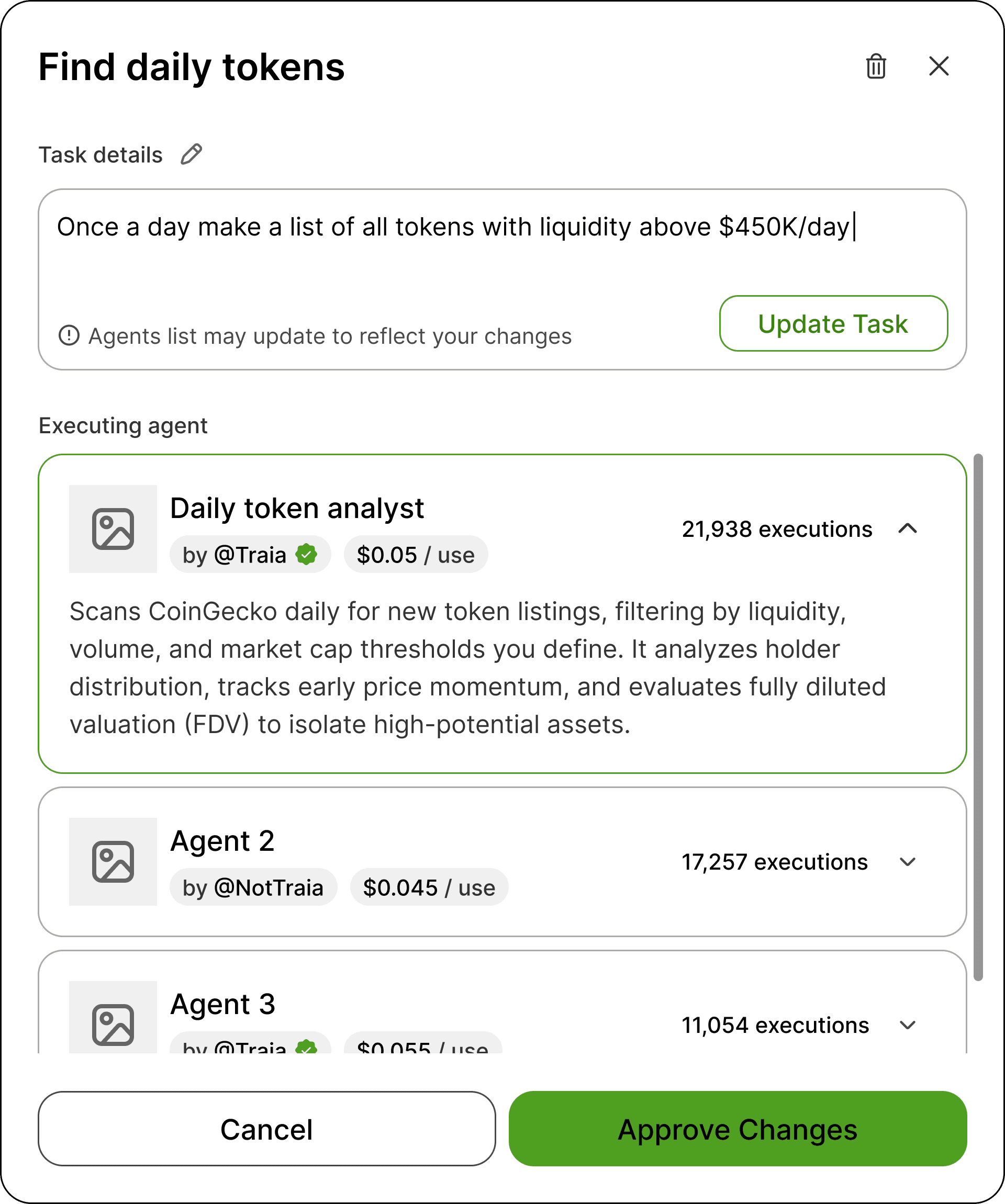
One issue to address was the single-agent carousel, which I replaced with an expandable vertical accordion list. However, this made the modal cramped and claustrophobic, forcing too much information into a confined space while still compromising the visibility of the agent options.
Another change I examined dealt with the task details input field - I added an edit icon to indicate editability, an "Update Task" button, and an inline notification warning that modifying details might affect the agent list. While this was an improvement, expanding the input field's height to accommodate the changes made the modal even more cramped. Furthermore, the irreversibility issue remained: the only way out was exiting the modal entirely, with no way to undo changes within the modal.
I also separated the Approve Changes and Delete Task actions, turning the delete option to a trash icon in the header. To prevent accidental deletions from this new location, I added a destructive action warning — however, rendering a confirmation modal on top of an existing modal created a poor visual and structural experience.
This clear usability friction made it evident that a modal was the wrong foundation.
UX Solutions & Redesign
Introducing a side panel for a safer, more intuitive editing experience
Realizing the modal was inherently limiting, I stepped back to question the overall layout. Moving the editing workspace into a Right Side Panel allowed the strategy canvas to remain visible in the background while creating room for a more intuitive, context-aware experience and provided me with more screen real estate.
To improve interaction clarity and reduce initial cognitive load, I structured the panel using progressive disclosure with distinct View and Edit modes. Entering Edit mode is an intentional action, ensuring users make changes purposefully without accidentally triggering system re-evaluations while reading or typing.
Side panel in view state: Keeping the strategy canvas fully visible in the background while providing dedicated space for micro-level editing.
Replacing the modal with a side panel allowed us to build better safety nets into the editing flow. The panel directly connects to the canvas Undo/Redo controls, paired with a dedicated Reset Changes button to quickly clear uncommitted changes.
To make the impact of task changes crystal clear, a disclaimer above the footer reminds users that updating a task might affect connected steps in the strategy. To back this up, I changed the primary button copy from "Approve Changes" to "Approve & Update Strategy" — making sure users understand the bigger picture before they save.

Side panel in edit state: Clear separation between states prevents unintended modifications and reduces cognitive load during task reviews.
In the previous modal layout, editing task prompt instructions triggered an awkward warning to users about their assigned agent no longer being a match — forcing them to manually re-select options.
In the new panel flow, updating task instructions automatically re-evaluates and updates the agent selection in real-time. Paired with a system banner and supported by global Undo/Redo controls and Rese Changes button, users receive immediate feedback without fear of losing their previous configuration.
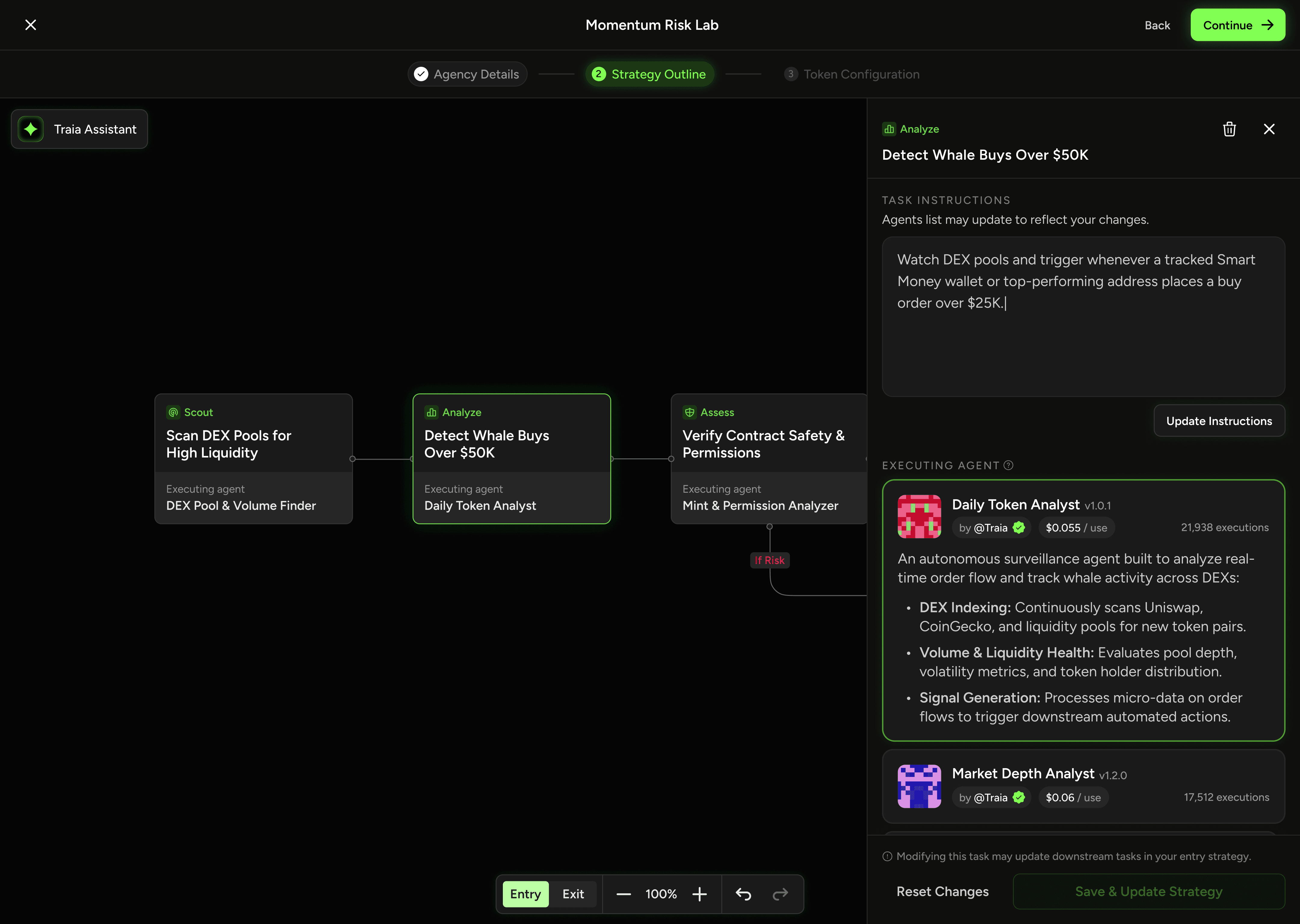
Task instructions edit: "Task Details" was renamed into "Task Instructions" for clarity, with the "Update Instructions" CTA activating upon text modification.

Live agent re-evaluation: The system updates the recommended agent list based on your new instructions.
To complete the automated feedback loop, the system also updates the task title and category tag when new instructions are updated to match the new prompt. This ensures the canvas and task details stay fully aligned without requiring manual edits.
